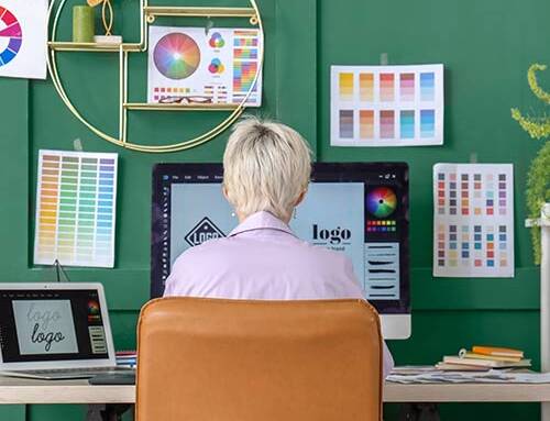
Web Design Predictions 2017 – What Will Come and Go
Even though we’re only 2/3’s of the way into 2016, here at Insight we’re already looking at the future of Web Design. So much has happened this year already like the domination of Mobile-First Design, Flat Design and Micro-Interactions to name a few, that it’s only natural for us to think ahead at how the design world can top what’s happened already. It’s always a smart move to stay on top of such trends and predictions so us designers can stay on top of what our clients want and deliver professional up-to-date projects.
In this post, we’re going to cover what we predict will thrive in 2017 along with what we expect to fizzle out and become obsolete in the upcoming months. Here are Insight’s predictions:
Trends to Come
Age-Responsive Design
 Over the last year we’ve seen the boom of Mobile-First Design. Instead of designing a website on your computer and then making it responsive by editing it to suit all devices, this is the backwards approach by working with how it’ll look on mobile first (hardest) then computers (easiest). A new trend has emerged in a similar form. Instead of basing your design around what devices will be used to view the site, designers have now adopted the thought of designing a website around the person using it, not what they’re viewing it on. Instead of covering a wide range of devices, it’ll now be the norm to cover a wide range of age groups. An abundance of metadata will now transform websites based on age-specific requirements.
For example we could expect to see adaptations such as:
- Automatically enlarging font-size for the elderly
- Boosting the strength of colours for the younger generation and making them more subtle for the older generation
- Younger/Older groups may be greeted by a stripped down interface while teens/adults will be greeted with the general flow of the site.
UX Failure Mapping & Simplification
User flow and journey mapping are the blood and guts of UX design – they provide the basic skeleton of a users journey through a web/app interface. However, there is one problem. They tend to be designed for ‘the ideal user’ and not ‘the non-ideal user’.
Over time, millions upon millions more of the world’s population are becoming more active online and soon we’ll reach a massive milestone – over half the world’s population will be active online on a regular basis by 2017. This will mean more and more digital novices will be present online along with those who’ve never experienced the internet and/or smart devices before so there will be a huge influx in user errors being made on a daily basis.
Similar to journey-mapping, the newer practice of failure-mapping will allow UX designers to better understand, anticipate, and model non-ideal scenarios, allowing us to better handle incorrect usage of products and services. This in my opinion is a need and not a want. Websites and Applications need to be ready for all those newbies and new customers who may not be as up to date and tech savvy as the previous wave of users are.
The ‘Tamagotchi Gesture’
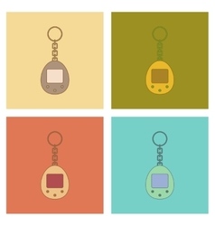 Do you remember Tamagotchi pets? Remember how you used to interact with them and when you left them idle for a certain amount of time, you were alerted to come back and interact with them further? You might see similar gestures in the future with your favourite websites!
Expect to receive notifications from the likes of Facebook/Twitter etc along the lines of ‘You haven’t contacted John Doe in awhile, message him today!’, ‘You haven’t left a status/tweet today, let everyone know what you’re up to’ or ‘You usually take a selfie at lunch time, take one now!’. This could prove to be either annoying or helpful. The user could either be bombarded by such messages or be thankful as such gestures could remind them to reply to a message or contact someone which they’ve forgotten about. I think this could be an effective addition but feel it should be a settings choice not mandatory.
AI & Virtual Assistants
We’ve all heard of Siri, Google Now and Cortana, but could we be introduced to even more AI & Virtual Assistants? Wouldn’t it be helpful if you logged onto eBay and instead of browsing hundreds and hundreds of shoes, to just activate the assistant and verbally ask for ‘mens brown dress shoes size 8’ and see amazing results that fit your exact needs? Or even the likes of Facebook (if this happens you could imagine Facebook being first in line) adding a virtual assistant to their application to interact and communicate with your friends quicker. This introduction could be a more effective and simplified version of a live chat window or a personal support area also.
Loading Anxiety
Have you ever bought or booked something online, hit ‘process’ and then panic slightly when the order is still processing after about 5-10 seconds? Or even worse, you process your order and have no idea if it went through successfully or not? That momentary state of anxiety a user experiences between an action (clicking a button) and a response (moving to the next page) should never take place as it could seriously effective a users experience on your website/app.
Instead of learning how to deal with this, designers are now using this response time to their advantage. Instead of having a process page redirect to a confirmation page ten seconds later, they’re looking into creating transition elements that cycle to the next screen in a sequence. Users during these transitions can be kept calm with a preview of the process with accompanied text along the lines of ‘Your order is now being processed, please wait a few more seconds’, and thus anticipate, rather than worry, about whats happening and what will happen next rather than crossing their fingers and hoping everything will be okay.
Cinemagraphs (The happy medium between image & video)
To wrap up our successful predictions, we’re looking forward to seeing more and more Cinemagraphs. Cinemagraphs are like the more professional HQ cousin of the Gif. Cinemagraphs are extremely powerful visuals that enhance the desired mood of a website. But wait, that’s only the start of it… Designers are always weary about the file size of videos and how it’ll affect the loading time of websites but this won’t be a worry with the Cinemagraph. Cinemagraphs are better than videos because they don’t eat up as much bandwidth, and they’re certainly much better than photos, because they provide something more than a simple still shot by adding subtle movement to the page. They are the happy medium! FINALLY! However, this technology isn’t exactly new, but we do expect to see it be integrated into more websites as optimisation and speed is a must in web design.
Trends to Go
Video-Heavy Websites
As you saw above, Cinemagraphs are predicted to be making a stand in 2017 as the likes of stock imagery may be on the decline as they can appear to be a bit fake and overly used as opposed to giving their website that individually creative edge. HQ videos are another touchy subject. Are they worth it? A HQ video can be over a hundred megabytes in size which can cause your website to lag. To solve this you can compress your videos but this generally leads to bad quality video which don’t look very appealing. Are videos on the way out and making way for the Cinemagraph? This will be an interesting one to look out for.
Stock Images
To continue on, what will happen to the Stock Images mentioned above? They’re a great resource for a project if you’re lacking your own professional photographs but in the end, would paying a professional photograph to provide you with unique and personal imagery be better than forking out for stock imagery? Would seeing your own team on your website as opposed to a stock team be more personal? It’s more expensive but would the extra money be worth it? This would be more up to the user/client as opposed to the designer. The future of stock images is in your hands!
The Hamburger Menu
 Hamburger Menus are dominating mobile sites as a way of saving valuable screen real estate. Have you noticed that a lot of new trendy websites are hiding their menu under a hamburger icon now as well? Yes it does save a lot of space and looks quite appealing but are they worth it? Devices may need it but do Larger Screens? If you’re looking for something quick this may hinder your changes of doing so quickly causing user impatience. Also, is everyone familiar with the icon yet? Do the older generation understand that the icon is the menu? This may reduce discoverability and cause many users to abandon a site after the front page therefore reducing your websites page views (bad for SEO). We predict that many sites will think twice before adapting this trend, or even older websites going back to the original menu format.
Aggressive Pop-Ups
Please please let this prediction be true! Pop-ups are becoming more and more in your face as time goes by. The invention of ad-blocker came along which was a fantastic success but the pop-ups eventually fought back. Websites began to alert users that they could only continue viewing the site if they disabled it which lead to the user being bombarded once again. This can seriously drive users away so we hope that pop-ups become less aggressive and a lot more subtle. Obviously ads are needed on the majority of websites, we know they’re there also, so why can’t they just be subtle and understanding about it? Fingers crossed!
Conclusion
This is only scraping the surface of Web Design Predictions for 2017 but they’re ones that Insight feel will be dominant in time to come. We hope you enjoyed this blog post and that the majority of predictions come true for the better! Only time will tell.
If you agree with the above then feel free to share it online by using the sharing icons below.