How your website ‘must’ be mobile-friendly and visually appealing to users
A 2018 Deloitte study recently revealed that 93% of Irish consumers have ‘access to’ or ‘own a smartphone’.
Furthermore, another study found that 86% of the Irish population regularly uses their mobile devices to surf the web.
With this fundamental rise in the use of smartphones and the fact that the general public is now increasingly relying on their phones to surf the web, a mobile-friendly and visually appealing website is a ‘must-have’ tool in your business marketing arsenal.
Building a ‘responsive website’ is the recommended way to go about it. Let me explain… a ‘responsive website’ is a website that adapts to the size of the device on which it is being viewed. So whether you view it on a tablet, phone or desktop, a responsive website offers the user a responsive, ‘user-friendly’, seamless and consistent experience.
Benefits of responsive design
If your users find it challenging to navigate or use your site (not responsive), they will have to constantly zoom-pinch the screen or squint to be able to read the text on your site. They will leave your site in no time. It’s a no-brainer!
A responsive website will scale and adapt to the screen size it’s viewed on. This way, visitors can read the text, use the navigation menu, or fill out the contact form.
As a result, they will have a better user experience and will likely spend more time on your website.
A website designed with mobile devices in mind will load quickly on all devices. Research shows that more than 53% of mobile visitors will leave a site that takes more than 3 seconds to load.
This will translate to a lower bounce rate and higher conversions and, eventually, boost your revenue and profitability.
Examples By Insight
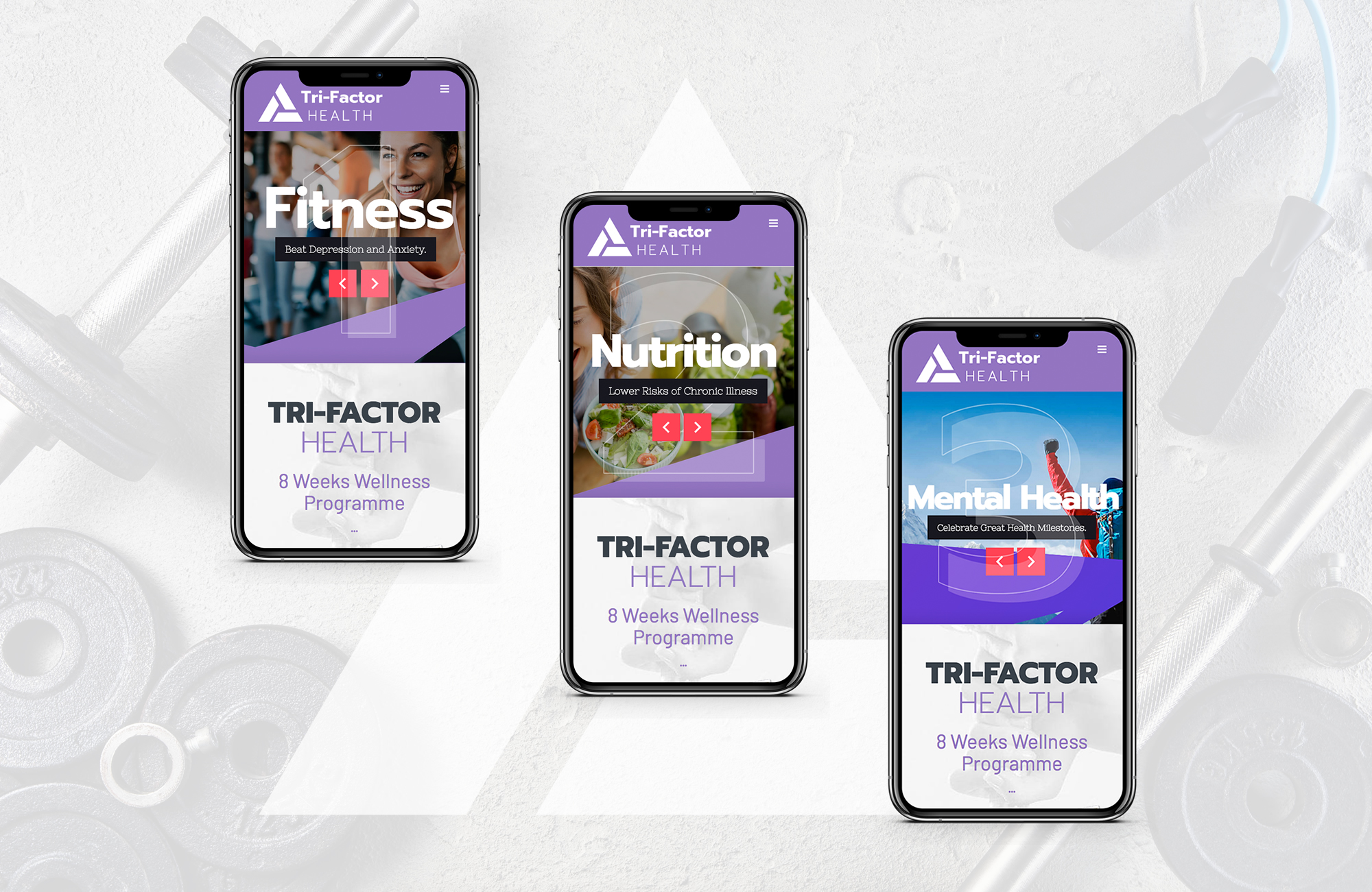
What makes a website mobile-friendly and visually appealing?
Design and colour – A visually appealing website makes the correct use of colours. After all, colours catch your eye, and they make you pause.
Usability – Make your users’ lives easy, especially when they are on ‘smaller screens’ when using mobile devices. A website that’s easy to use is more likely to be a successful product or service selling tool. A user-friendly website must ensure that it has a clear and simple menu, a crisp layout that is easy to use, and a text size that is easy to read and legible without having to squint.
Consistency – A consistent design ensures visitors are focused on the message. An inconsistent layout will ruin the experience and distract users from the vital information you are attempting to relay to potential customers.
Graphics and photographs – Good imagery creates instant visual appeal and an ambience of quality and class. Quality imagery builds trust and credibility and helps you retain your users’ interest for longer.
Tips to make your website visually appealing and mobile-friendly
When you want a mobile-friendly website that’s also visually appealing, be sure to build a website with your end users in mind. Instead of focusing on elements you like, focus on things that will improve usability for the user. Follow these tips:
- The typography should be legible.
- Navigation must be dynamic and fluid. A hamburger-style menu (represented by three horizontal lines) is an excellent example of easy navigation and accessibility on mobile devices. So, your traditional standard text menu on the desktop version of your website should shrink down to a hamburger-style menu on mobile devices.
- Business-to-business users will usually use the desktop version of your website (sitting at a desk during office hours), so the desktop version of your website should be equally functional, intuitive and visually appealing.
- Forms should be simple and easy to fill in on mobile devices.
- Make calls to action functionally as simple and fast for the user to engage in.
- Buttons should be large and easy to press, ensuring you improve the conversion rates of potential new customers.
- Avoid cluttering any of your website pages. Ensure you put only a few elements on any page/screen. The more you put on a page, the more you split the attention of your visitors.
In conclusion, your website’s desktop version (business to business) and mobile version (non-B2B) are equally important to your business. At Insight, we build business websites for our customers that address all devices and ensure that their websites work effectively on all screens and platforms with equal importance.
Credit: Bob Stokes

